This design project has been described by Yawn Design Studio as; "Couture meets French farmhouse." In a South Florida landscape this stunning home is more akin to French Chateau than French farm house. However, you may be surprised when you look inside. The home owner's brief was to use "materials with muted and neutral tones" and this has been achieved with great success.
I have seen some beautiful homes since I began blogging and Tillinghast Estate, is most definitely on my top ten. Yawn Design studio, the designers behind the interior of this project, proud themselves on being artists in their work, saying, "We are the artists who awaken the human spirit through interior design". Bruce Goforth and Shannan Puschmann Goforth have taken aboard their client's brief and the end results are the perfect balance.
Above: Simple elegance in formal surroundings
Above: A traditional style hallway surprises as it leads to an expansive, open plan living area.
Above: The lime washed wooden cupboards and coral add an organic feel to this otherwise formal setting. Different materials work together to create a relaxed atmosphere .
The natural wooden coffee table and colours of the jute cushions, work wonderfully with the beams above.
Above: An elegant setting blending woods from from dark to light. The crystal chandelier balances this setting.
Above: The kitchen has farmhouse appeal - It has been kept light, neutral and informal.
Above: A quiet dining area that needs little in the way of furniture or accessories to show it off - Appropriately situated to take in the outside views.
Above: The covered outdoor patio is perfect for all year entertaining. When I eventually build, I most definitely want to take aboard the idea of a covered outdoor area.
Above: A stunning staircase such as this, needs little to detract from its beauty.
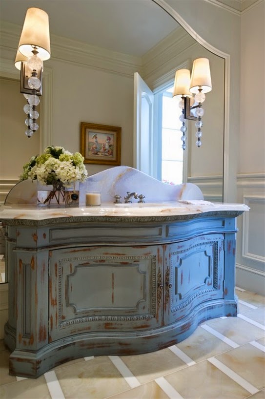
Above: I am not sure if this is re-purposed or not, regardless I love the intention and the finish is a perfect compliment to the marble top.
Above: One of the bedrooms, a touch of elegance, unfussy and tranquil in its surroundings.
I hope you enjoyed touring this stunning home, I have been especially inspired by the open plan living space with its soft neutral tones and mix of textures and accessories. In a neutral interior, layering and texture is the key and there are so many lovely layers that lead through from the living area to the kitchen beyond. With a home as grand as this, it could easily have felt too formal. However, the designers have allowed their design to compliment, not fight with the formal architecture which has resulted in just the right balance.
To view more images of Tillinghast or discover more about Yawn Design, please visit their website.
I will be linking this post with the following blogs:


.jpg)


No comments:
Post a Comment